Is it Wow or Just about Time?
We all know and love Jenkins despite some of its historical quirks. The community is now on a march to introduce some new concepts and a more modern UI that includes support for visualizing build pipelines. I’m very happy with this project direction! Since 2012 I have been waiting anxiously to see some graphical support for workflow configuration and review in Jenkins. Similar features are standard in other workflow tools, but did not seem to find their way into the Jenkins core. Now every tweet seems to be a ‘Wow!’ for the new UI improvements of Jenkins. In this exciting moment do we really think that Jenkins has caught-up with the graphical workflow world?
I started using Jenkins-CI almost 5 years ago and I was ecstatic with the functionality I could get out of this little gem of a workflow engine for life-science data management and analysis. Soon I had it crank through thousands of images generated in our lab from High Content Image analysis, generating useful numerical data. Most recently, coupled with the power of the R statistical language much of these numerical data can be processed into a variety of statistical graphs and plots and biologically relevant information for the discovery of new medicines. It was not the first time I had hijacked a build system for life/data-sciences service. In the past, I had build biological data management workflows based on ‘Ant’, ‘CruiseControl’ and ‘Gradle’ and I was just happy to find a new build system that provided a way to easily enter build parameters (free style project) to support the needs of life science data flows.
Look Ma! Configuration without XML!
Well…not exactly! But still great! Having build workflows with Ant, I was already traumatized from writing and editing XML build files by hand. Jenkins build configuration is still stored as XML, but it’s edited through the Jenkins configuration page. The job configuration page is now a major focus of the Jenkins 2.x UI improvements. The form has transitioned from one long unwieldy configuration page to one (still long) form but with improved navigation to various project sections by using a set of easily accessible tab hyperlinks. The new project configuration page is certainly an improvement for initially configuring a project. However, what still remains a challenge is the lack of any significant tools (graphical or otherwise) to review the project configuration in the future. The only way to do this is to return to the configuration page and access each of the job sections to review settings and actions. There is no easy way to visually inspect the project steps, actions and parameter configuration. Not even a simple tabular summary that I’m aware off. What about the various project dependencies in terms of plugins, groovy scriptlets and external executables? In my experience (and opinion) the limited options for graphically reviewing Jenkins jobs and drilling down to their components and parameters (a common practice in workflow systems) is a major headache especially if you are maintaining multiple jobs and several job versions.
Build Pipeline Visualization
Visualization of build pipelines (job instances) seem to have received more attention. Several Jenkins plugins exist that provide graphical visualization of in progress and build pipelines from build history. One of my favorites (and with over 18K installations apparently a favorite of many others) is the Build Pipeline Plugin. The Build Pipeline plugin provides a Build Pipeline View of upstream and downstream connected jobs that typically form a build pipeline.
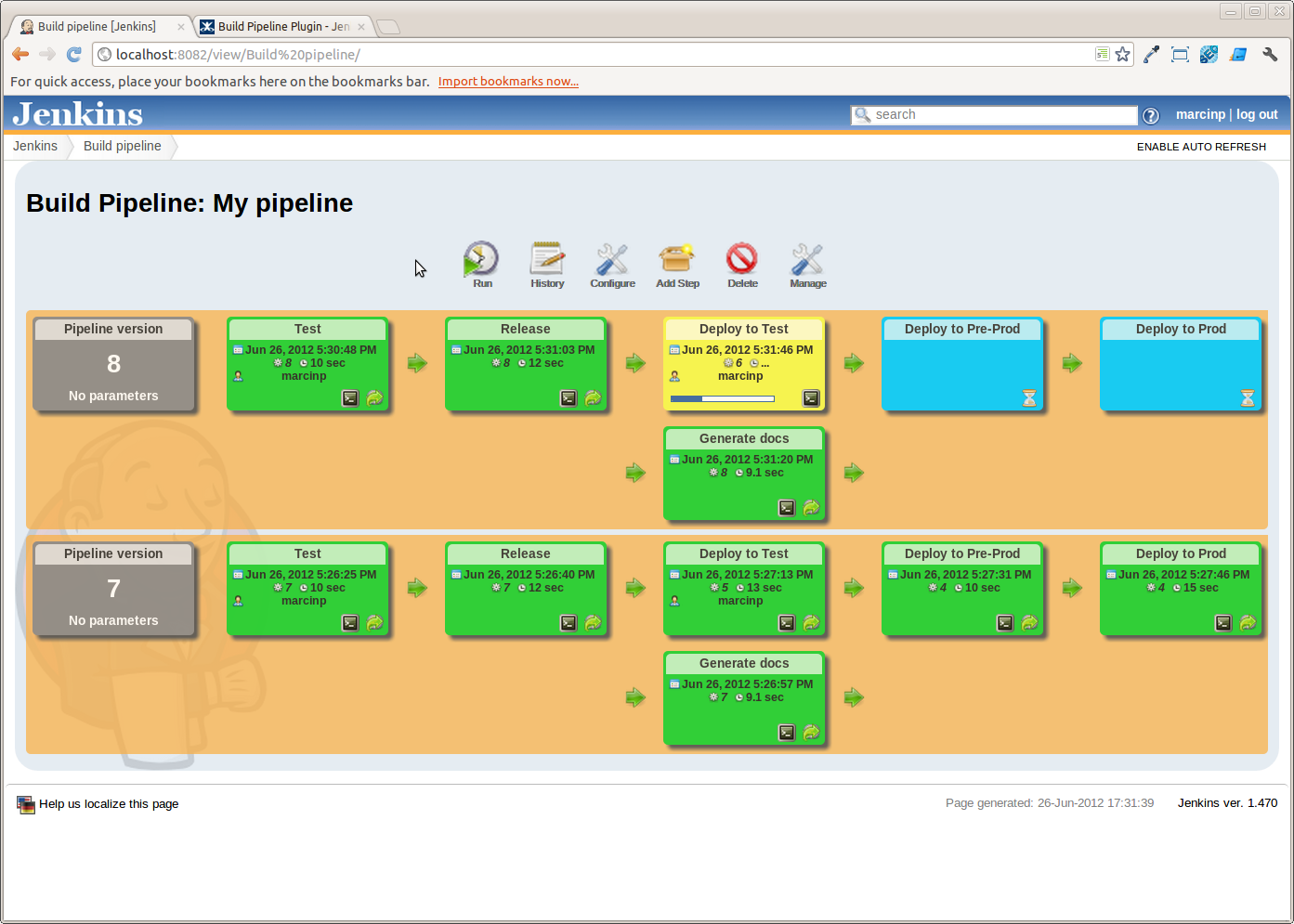
Figure 1: Build Pipeline visualization using the Build Pipeline plugin
The Delivery Pipeline Plugin provides a similar visual representation but jobs can be further grouped to form stages.
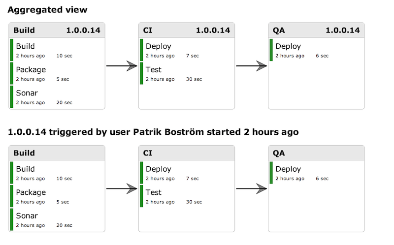
Figure 2: Visualization of a pipeline with several stages using the Delivery Pipeline Plugin
In both the Build Pipeline and Delivery Pipeline visual representations, the individual project details displayed are rather limited. The Build Pipeline Plugin allows listing the parameters of the first job but no other job details are available. Importantly, the visualization capabilities of this plugin are available only after a specialized ‘Build Pipeline View’ is added. This makes it impractical for visualizing large numbers of jobs and jobs that are not linked into pipelines. It’s clear that the main focus of these plugins is the visualizations of the status (success/failure ) of the pipeline as a whole and not the review of the parameters/actions/steps of a job. A good introduction to pipeline orchestration and visualization can be found in the Orchestrating your Delivery Pipelines with Jenkins blog post.
Visualizing Scripted Workflows
One of the problems encountered with chained job pipelines is the fact that the entire pipeline is not captured in a single place (file) but it is distributed in the individual contributing job configurations. In addition, although the concept of a ‘downstream build’ is well established and captured as such in the build log, an ‘upstream build’ is not recorded in the build log. Both of these issues contribute to challenges when the pipeline and its versions need to be documented and maintained. As a result, the Jenkins community and CloudBees (the company providing commercial support for Jenkins) have come with the concept of scripted pipelines a.k.a pipeline as code. Now the entire pipeline can be scripted using Groovy based DSL and the Job-DSL plugin, or the Pipeline plugin. These plugins do solve their intended issue, but they now further complicate job comprehension as multiple job configurations are captured in a single script. Unfortunately, these plugins do not offer any additional graphical tools for the detailed comprehension of a pipeline project’s structure. Similarly to the Build Pipeline plugin, they provide graphical views of a running pipeline and build history but no visibility into the detail configuration of each job.
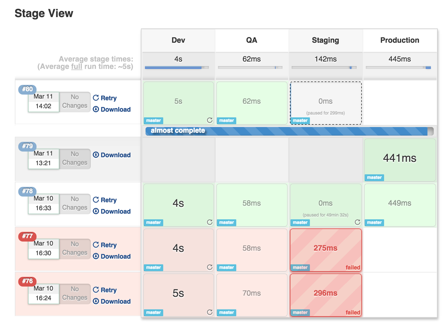
Figure 3: Visualization for a scripted Pipeline
Standing on my Soap Box
The observations I just described make me a little more pragmatic and reserved for the new Blue Ocean UI of Jenkins introduced this past week. Twitter was on fire with comments and kudos for the project! Obviously, the perceived functionality/usability of a software is largely attributed to a modern and responsive user interface. A couple tweets that made me smile said ‘Wow, the new Jenkins UI finally looks usable!’ and another ‘Oh wow, a Jenkins UI that not only doesn’t suck but actually looks really awesome.’
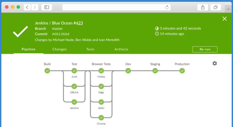
Figure 4: The new Blue Ocean Jenkins scripted pipeline view
I’m looking forward to testing the new Blue Ocean plugin to see if it improves on the job comprehension issues that I have described in this post. But somehow, I think that it will just provide a more visually pleasing backdrop for the existing graphical visualizations. In promoting Jenkins for life and data science duty, I’m obliged to compare it with existing tools in the field such as Knime the Galaxy Project and the commercial Pipeline Pilot tool.
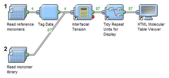
Figure 5: The Pipeline Pilot Workflow Editor
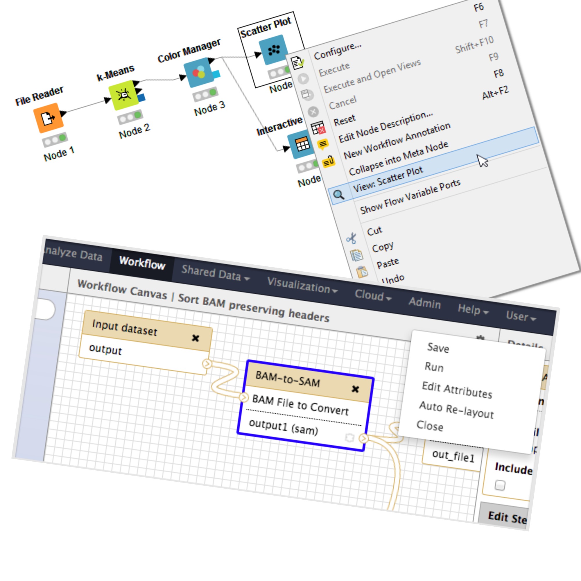
Figure 6: Workflow editor in Knime and Galaxy
All of these tools provide interactive configuration and exploration of scientific workflows with well organized libraries of components that can be used to construct and enhance the data pipelines. I think that Jenkins would benefit from a similar approach to the exploration and construction of jobs and job pipelines. In the mean time, I welcome the Blue Ocean Jenkins project and hope that it will truly form the basis of a more interactive, modern and comprehensive framework for building future life and data science applications.